
Frontend development has really taken off and arguably become an artform, designers are creating beautiful seamless experiences that work across multiple devices and display vast amounts of content whilst remaining relevant to the user. As an engineer I have always had a craving to see the technical side of website design, so I jumped at the earliest chance to ditch my previous website made using a no code application and began learning.
Short answer: Nope :)
Building my website has been my most demanding project to date. I figured that with my experience in python and MATLAB, learning HTML, CSS and JavaScript would be a breeze – I vastly underestimated this! Although I am a fast learner and can pick up concepts with ease, I quickly realised the mammoth task that lay ahead of me: learning new languages, web framing, ensuring my website looks visually stunning on all devices, hosting and general optimisation and debugging. Nonetheless, I persevered and learnt these languages from scratch through a variety of online and offline sources. I completed most of the learning and subsequent programming in my spare time during the final months of my industrial placement with Siemens Healthineers. Then I completed the optimisation, deployment and bug fixes more recently.
I began by learning the basics of HTML and CSS – concepts such as classes and selectors, semantics, positioning and generally adding colour and flare using CSS. I started off making practice webpages hosted on a local server using Microsoft visual studio and then slowly developing them further and creating more complex webpages with some user interactivity like drop down menus and buttons.
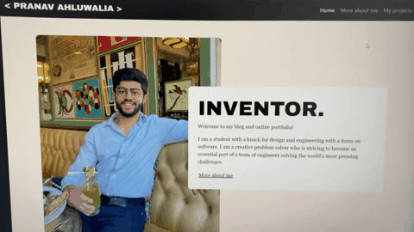
Notice how all the buttons on my website change colour, fade in or fade out when you hover over and even how the big blog post tiles are either blurred or clear depending on if they are unreleased or released respectively. Although small, I think details like these really help to make the website more visually pleasing to the user.
An area of great importance that has been a focus of UX designers for many years now is creating responsive webpages. Meaning that the website looks great and maintains full functionality on all devices no matter if you resize the window or read the website from your phone. Full functionality is defined differently based on the device that you use. For example, having a large navigation bar at the top of the webpage for a mobile device will not be an optimal solution for page navigation, instead a drop-down menu would be more appropriate. In addition, all text and images will need to be resized and optimised to fit the changed screen dimensions. This was by far the biggest challenge as I struggled with the repositioning of text and images and making transitions more fluid. I eventually came across the bootstrap library that adds functionality for certain parts of the website to be resizable. This framework made development a lot faster and it’s what I have used to create the responsive navigation bar for this website.
Implementation:
Notice how the navigation bar changes as you resize the page: At normal laptop width the navbar items are set on the right, at tablet width the navbar is hidden and incorporated into a drop-down menu on the right. Finally at mobile width the navbar is incorporated into a drop down menu that is acessed by clicking on my name. Furthermore, notice how the whole website fluidly resizes text and media depending on the size of the window. I was very proud when I achieved this as I would say that making the website responsive was the part of my learning process that had the steepest learning curve. The images below show how the navbar transitions. Resize the window to try it for yourself!
Technicals:
I achieved this responsiveness through the use of separate CSS files which each kick in at different window sizes. I.e I had a CSS file that defined the colours, positioning etc of the webpage on desktop devices and then I had a separate CSS file that defines these parameters for smaller mobile devices. On top of this I also made extensive use of the bootstrap library that allows the website to stay responsive in the region where the window is not small enough to switch to the mobile CSS sheet and vice versa. Using separate CSS sheets like this is better than using many media queries in my opinion as the website will send fewer HTTPs requests, hence allowing the site to run faster and more smoothly. The image below shows the lines of code that allow the website to automatically switch between pages (this is for the Projects page):

The majority of the backend work for this project was related to hosting the website.
Running and operating a server that is online 24/7 is energy intensive and adds unnecessary complexity for this project as traffic volumes will be low. So instead, I opted to use google firebase as a hosting service. This was relatively straightforward as I installed the files and dependencies and linked it to my domain. After this I mostly worked on bug fixes to make sure that everything is working nominally on all devices.
I also spent a couple of months learning JavaScript as it is an immensely powerful language that allows the developer to greatly increase user interactivity, although at the moment I haven’t had a need to include any JavaScript functions on this website. You will see more JavaScript and React from me in my upcoming virtual property exchange project!
I am very proud of this website as I have vastly improved my technical literacy in the programming field. Furthermore, now that I have started coding and understand all the intricacies and areas of improvement, I can’t stop! I am constantly looking for ways to improve the website and add functionality. My next steps for the website are to add more content to showcase my other extracurricular projects and their significances. I am working to adopt a continuous delivery approach where I can test, build and deploy more often. Not only has this project left me with a thorough understanding of front and back-end web design but I also have a great newfound appreciation for this field and its intricacies. I hope this very brief insight into my web design experience has been insightful and has maybe inspired you to go out and learn web design yourself!